Displaying individual data
It is important to look at the graphs of the individual data.
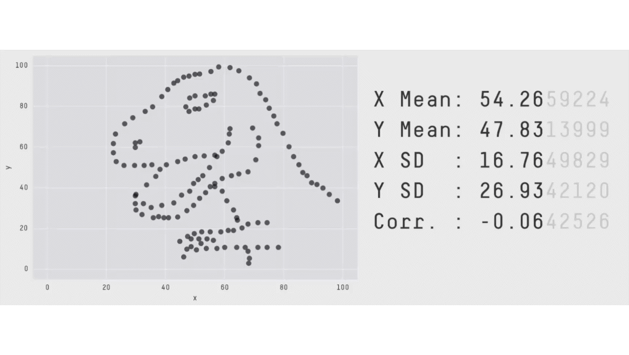
There could be cases where two different data show two different patterns, but the numerical descriptives are the same, as demonstrated in the following spectacular animation taken from this website.
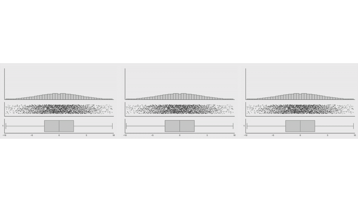
While probably one will never see these extreme examples, there could be some more realistic cases, like bimodal data. See a similar simulation when the distribution of the data are changed, while the box plot of the data remains the same (taken from the same website).
Another, even more realistic example is shown in Weissgerber et al. (2015):
This problem was described by Anscombe (1973). See a summary of the problem on Wikipedia. More examples with an algorithm generating demonstration data are presented in Matejka & Fitzmaurice (2017). (More information about their project with downloadable code on their website.) (The famous dino data is coming from here.) See also the tyranny of averages.
Chosen methods for CogStat
For this reason, CogStat usually displays the raw data at the beginning of the analyses, and it shows individual data on several graphs displaying sample properties.
References
Anscombe, F. J. (1973). Graphs in Statistical Analysis. The American Statistician, 27(1), 17–21. https://doi.org/10.1080/00031305.1973.10478966
Matejka, J., & Fitzmaurice, G. (2017). Same Stats, Different Graphs: Generating Datasets with Varied Appearance and Identical Statistics through Simulated Annealing. Presented at the ACM SIGCHI Conference on Human Factors in Computing Systems. https://doi.org/10.1145/3025453.3025912
Weissgerber, T. L., Milic, N. M., Winham, S. J., & Garovic, V. D. (2015). Beyond Bar and Line Graphs: Time for a New Data Presentation Paradigm. PLOS Biology, 13(4), e1002128. https://doi.org/10.1371/journal.pbio.1002128